

In 2025, having a responsive design is no longer optional—it’s essential for the success of any WordPress website. With the growing reliance on mobile devices and changing search engine algorithms, a responsive design ensures your site is accessible, user-friendly, and competitive in search rankings. This blog explores why responsive design is crucial for WordPress sites, its impact on user experience and SEO, and how you can implement it effectively.
What Is Responsive Design?
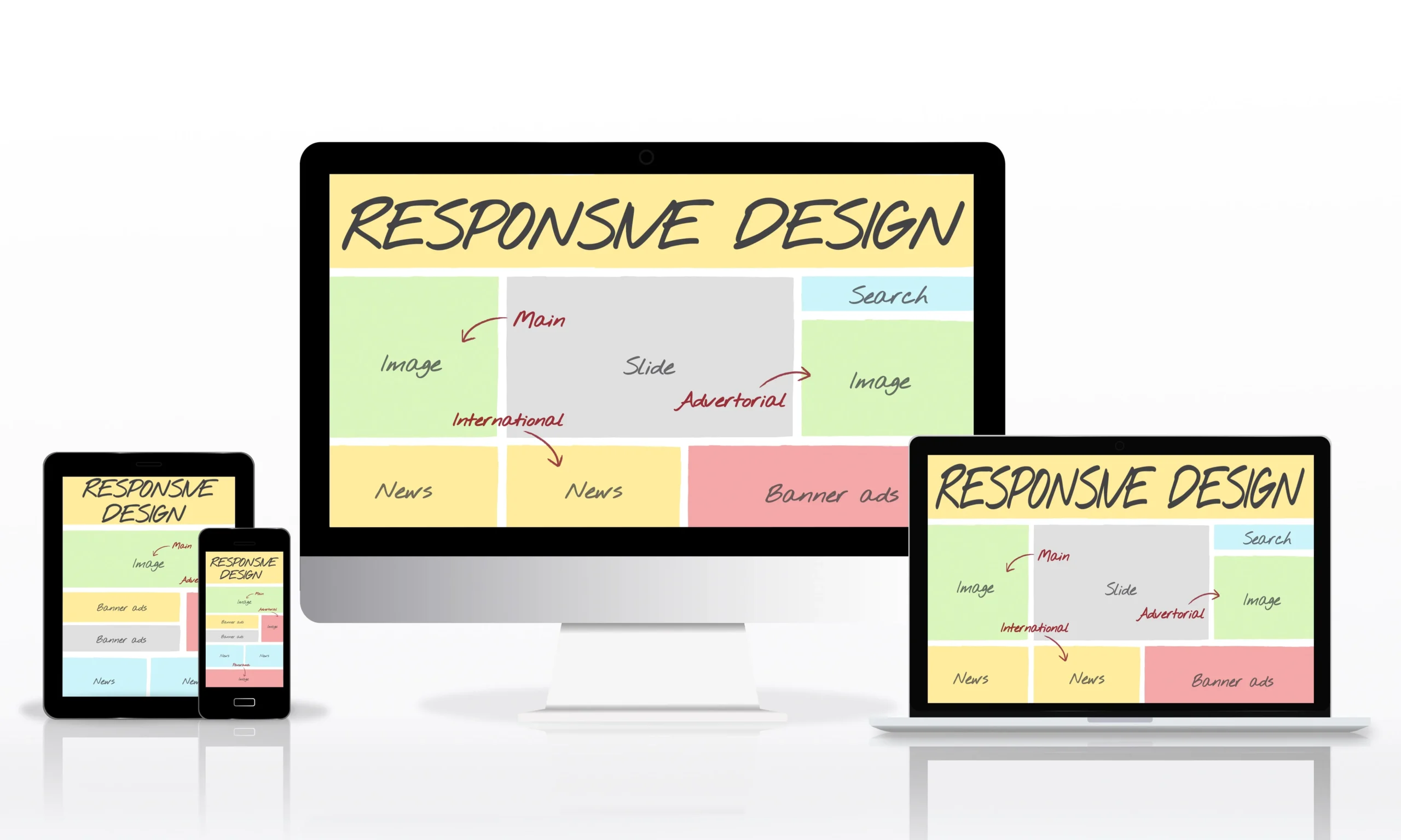
Responsive design ensures that your website adjusts seamlessly to different screen sizes and devices, whether it’s a desktop, tablet, or smartphone. The goal is to provide an optimal viewing and interaction experience for every user, regardless of the device they use.
In simpler terms, a responsive WordPress site adapts dynamically to ensure:
- Properly scaled images and text
- Easy navigation and usability
- Faster loading times on all devices
Why Responsive Design Matters in 2025
Mobile Usage Dominates Web Traffic
As of 2024, mobile devices account for over 60% of global web traffic. A site that isn’t mobile-friendly risks alienating the majority of its audience. Responsive design ensures your WordPress site caters to these users, keeping them engaged and satisfied.
2. Search Engines Prioritize Mobile-First Design
Google has been rolling out mobile-first indexing, meaning it primarily uses the mobile version of your site to determine rankings. If your WordPress site isn’t responsive, you could see a drop in visibility and organic traffic.
👉 Learn more about Google’s mobile-first indexing.
3. Enhanced User Experience (UX)
Responsive design eliminates the frustration of pinching, zooming, or scrolling excessively on mobile devices. A smooth UX keeps visitors on your site longer, increasing conversions and reducing bounce rates.
How Responsive Design Boosts SEO

Responsive design plays a direct role in improving your WordPress site’s SEO performance:
1. Lower Bounce Rates
Search engines interpret high bounce rates as a sign of poor user experience. A responsive design ensures visitors stay on your site longer, signaling to search engines that your content is valuable.
2. Faster Load Times
Responsive websites are optimized for speed, especially on mobile devices. Tools like Google’s PageSpeed Insights can help you measure and improve your site’s loading time, a crucial ranking factor.
3. Consolidated URL Structure
Responsive design uses a single URL for desktop and mobile versions, making it easier for search engines to crawl and index your site. This consistency improves your SEO rankings.
Key Features of a Responsive WordPress Site
To ensure your WordPress site is truly responsive, focus on these features:
1. Responsive Themes
Choose themes specifically designed for responsiveness, such as Astra, GeneratePress, or Divi.
2. Fluid Grids
Use flexible grid layouts that adapt to various screen sizes and resolutions.
3. Optimized Media
Implement scalable images and videos that don’t disrupt the site layout on smaller screens. WordPress plugins like Smush can help optimize media for responsive design.
👉 Discover more WordPress plugins for better design at SlideGain.
Steps to Implement Responsive Design on WordPress
Choose a Mobile-Friendly Theme
Start with a WordPress theme that supports responsive design. Test the theme’s demo to ensure it adapts well to all devices.
2. Enable Viewport Meta Tag
Add a viewport meta tag to your site’s header to ensure the content adjusts according to the device’s screen size.
<meta name="viewport" content="width=device-width, initial-scale=1.0">
3. Use Responsive Plugins
Install plugins like Elementor or Beaver Builder that offer drag-and-drop tools for creating responsive layouts.
4. Test Responsiveness Regularly
Use tools like Google’s Mobile-Friendly Test or BrowserStack to check how your site performs on different devices and browsers.
Challenges of Ignoring Responsive Design
Failing to implement responsive design can lead to:
- Reduced mobile traffic and conversions
- Lower SEO rankings due to poor UX and slow speeds
- Increased bounce rates and lower engagement
In today’s competitive digital landscape, ignoring responsive design isn’t just a missed opportunity—it’s a risk to your site’s success.
Conclusion
Responsive design is non-negotiable for WordPress websites in 2024. From improving mobile usability to boosting SEO rankings, a responsive site meets the demands of modern users and search engines. Don’t let an outdated design hold you back—invest in responsive design today and watch your WordPress site thrive.
Ready to make your WordPress site fully responsive? Contact SlideGain and let us help you stay ahead of the curve!
